
Open any trading app and the chart looks like chaos — a wall of little green and red bars. But a candlestick chart is one of the simplest, most information-dense ways ever invented to show what price is doing. Learn to read it and the market stops looking random; you start seeing pressure, hesitation and turning points. Here's the beginner's version, without the jargon.
What a single candlestick shows
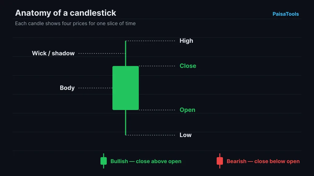
Each candle represents one slice of time — a minute, an hour, a day, whatever timeframe you're looking at. In that slice it records four prices: where it opened, where it closed, the highest it reached, and the lowest it fell to. The thick part in the middle is the 'body' (open to close); the thin lines above and below are the 'wicks' (or shadows), marking the high and low. That's the whole alphabet.
Green vs red candles
A green (or white) candle means price closed higher than it opened — buyers won that slice of time. A red (or black) candle means it closed lower than it opened — sellers won. A long green body means strong buying; a long red body means strong selling. A tiny body means buyers and sellers fought to a draw. Read a run of the same colour and you're looking at a trend.
The wick tells the story
Wicks are where the real information hides. A long lower wick means price fell hard but buyers pushed it back up before the close — rejection of lower prices, often a sign of support. A long upper wick means price spiked up but sellers slapped it back down — rejection of higher prices, often resistance. A candle with wicks on both ends and a small body is indecision. The body tells you who won; the wicks tell you how hard the other side fought.
Practise reading a live chart — free, no real moneyA few candlestick patterns worth knowing
- Doji — open and close almost equal, so the body is a thin line. It signals indecision; after a strong move, it can warn of a reversal.
- Hammer — small body at the top with a long lower wick, after a fall. Buyers rejected the lows; often a bullish reversal hint.
- Shooting star — the opposite: small body at the bottom with a long upper wick, after a rise. Sellers rejected the highs; a bearish warning.
- Engulfing — a big candle whose body completely swallows the previous one. A bullish engulfing after a downtrend (or bearish after an uptrend) signals momentum flipping.
One warning: patterns are hints, not guarantees. A hammer doesn't mean 'buy now' — it means 'buyers showed up here, pay attention.' Context (the trend, the level, what came before) matters more than the pattern in isolation. Beginners lose money treating patterns as magic buttons.
How to actually learn to read charts
Reading about candles gets you maybe 10% of the way. The rest is reps — watching real candles form and seeing what happens next, over and over, until the shapes mean something instinctively. The fastest way to get those reps without risking money is to trade a live chart in a game. Take a position, watch the candles print, and feel how a long upper wick or an engulfing candle actually plays out. A few sessions teaches your eye more than a week of videos.
Read the live market yourself in Market RacersFrequently asked questions
- How do you read a candlestick chart for beginners?
- Each candle shows four prices for a time slice: open, close, high and low. The body (open-to-close) is green if price rose, red if it fell; the thin wicks mark the high and low. Long bodies mean strong moves; long wicks mean the price was pushed back. Reading many candles in a row shows the trend.
- What does a green candle mean?
- A green (or white) candle means the close was higher than the open — buyers were in control for that period. A long green body means strong buying pressure.
- Are candlestick patterns reliable?
- They're hints, not guarantees. Patterns like hammers or engulfing candles improve your odds only in the right context (the trend and the price level). Used alone as buy/sell signals, they're unreliable — which is why practising on a risk-free chart matters.